

Our website has always been very successful, bringing in a large amount of traffic, which has increased year on year. This year we decided it was time to update the Roman website to build on its success. We have done this by updating the website with the latest features and technology, which are there to provide the ultimate user friendly website experience.
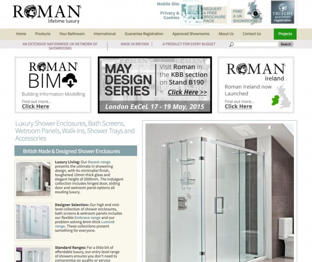
Roman’s previous website homepage

Roman’s updated website launched 10th August 2015
Our website introduces a brand new layout, a new design and use of the latest technology to make sure we provide the user with an easy and quick navigational system.
We have implemented colours to the website that are consistent with our new brochures, POS and any other literature that we circulate. For example, every Roman Range has its own dedicated colour and this is applied to the brochure, POS and now the website, which will make it easier for people to quickly and easily distinguish which range, is which.

Roman’s Range colours in the brochure

Roman’s Range colours on the website
Our unique “water people” have also been used on the new website as they are used throughout Roman’s new POS and brochures. We have created video capability on the banner of the homepage, so we can add our own videos which people will instantly see when they enter the site – this is to keep the site visually interesting for the audience.

Roman’s “water people”
The homepage has been designed with a story telling design, which makes the whole user experience on our website as friendly as possible. The story telling design guides the user around the site, helping them to find what they are looking for with ease. We have also incorporated a ‘back to top’ button, so when you are at the bottom of the Roman website (on any page) you don’t have to scroll all the way up, you just have to click the button and it will take you straight to the top of the page.
To add to the user friendly experience we have added a newly designed search facility. When you click on the search box it cleverly expands to the width of the page and allows you to type in what you are looking for. This will increase the searching speed to help the user get to the product they are interested in instantly.
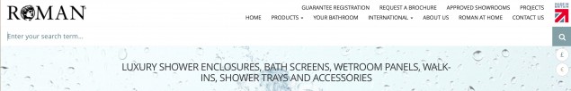
New Search Facility
Many visitors to the Roman website now come to the site using a mobile phone or tablet device, so it is very important that our new design and layout are reflected in this view too. We make sure that we don’t over complicate the mobile and tablet views, by only showing the key links and messages on the homepage, so the user can be directed immediately to where they need to be. The navigation system slides out from the right hand side of the screen, instead of the left to make it easier to operate and search around the Roman website, whilst holding a phone.

Mobile View of the Roman website